“The rights and capacity to use, create, and share information in ways that are meaningful to each individual, community, or organization.”
July 8th 2020 – The Technology & Social Change Group at the University of Washington Information School has released the Development and Access to Information (DA2i) Dashboards, a data visualization platform that tracks the progress of countries and regions on key indicators related to three dimensions of meaningful access to information: Connectivity, Freedom, and Gender Equity.
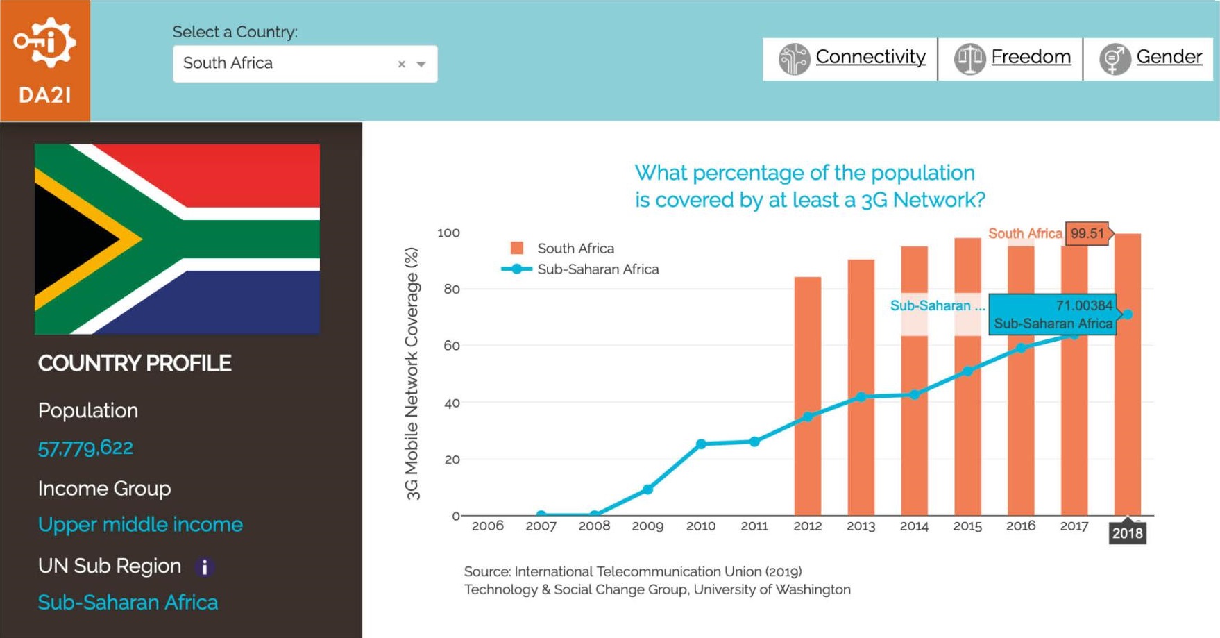
The dashboards will be a useful tool for researchers, social organizations, policy-makers, public libraries, activists, and communities, allowing them to explore connectivity, freedom and gender equity trends at the country-level. They reflect our commitment to make knowledge more democratic and science more open and accessible to everyone.
Combining public data from different authoritative sources, including ITU, UNESCO, ILO, and Freedom House into a carefully curated single database, the DA2i dashboards feature historical trends for twenty selected indicators. They offer visual displays, a comparison with regional averages, and additional context to better understand how each indicator relates to meaningful access to information.The dashboards are also an important tool for identifying data gaps in some of the most critical indicators of social development.
To facilitate analysis and comparison, each indicator is organized by year, UN regional categorization, income level, and standardized country names following the World Bank country classification. The dashboards bring this database to life and make it analytically more useful and accessible to broader audiences with different levels of data literacy skills.
Explore the dashboards for country trends, use the graphs and tables in reports, presentations, policy briefs, or grant applications, or download the database to identify themes that merit further analysis and can pave the way for much needed future research.
The database feeding the platform was first created and curated in 2016, as a core pillar of the Development and Access to Information (DA2i) report series, produced by the International Federation of Library Associations and Institutions in partnership with TASCHA. The report, issued once every two years, includes a TASCHA-led chapter based on analysis of this database that tracks governments’ progress towards fulfilling their commitments to promote meaningful access to information, as part of the UN Sustainable Development Goals
The dashboards’ platform was built using Dash and Plotly, an open source Python library, and the code, technical notes, and full database (except for three ITU indicators that are proprietary) are publicly available on GitHUB.
TASCHA would like to thank the team that brought this project into fruition: Daniel Rekshan, Manisha Vyas, Lucas Koepke, Bree Norlander, Chris Rothschild, Araba Sey, and Chris Jowaisas. The research was supported by a TASCHA Innovation Award, funded by the Bill & Melinda Gates Foundation.
For any additional information and feedback, please contact the project lead Maria Garrido migarrid@uw.edu or visit the Dashboards FAQs page.
DA2i Dashboards FAQs
- What are the different ways in which I can use the dashboards?
There are many ways in which you can use the dashboards, depending on your objectives and data literacy skills:
- As a tool to swiftly explore connectivity, freedom and gender equity trends at the country-level.
- To identify data gaps in some of the most critical indicators measuring social development.
- Use graphs and tables in reports, presentations, policy briefs, grant applications, or to impress your friends and family. Hover over charts to reveal a menu in the top right of the chart to download or to zoom-in.
- Download the full database from GitHUB to identify themes that merit further analysis and pave the way for much needed future research.
- How is meaningful access to information defined?
Throughout the Development and Access to Information (DA2i) initiative, meaningful access to information is defined as the rights and capacity to use, create, and share information in ways that are meaningful to each individual, community, or organization. The degree of meaningful access for individuals and groups is influenced by a combination of structural factors that determine to what extent information can contribute to advancing the United Nations’ Sustainable Development Goals (SDGs).
- Why is meaningful access to information relevant to the UN 2030 Agenda?
In 2015, the UN agreed on a new comprehensive framework to end poverty, protect the planet, and ensure prosperity for all – the 2030 Sustainable Development Agenda. To achieve these aims, the agenda outlines 17 Sustainable Development Goals (SDGs) in areas including poverty, health, agriculture, gender equality, innovation, and youth employment, with specific targets for each goal. Access to information and communication technologies underpins the achievement of the SDGs (eleven of the 169 targets included in the Agenda present access to information as a key tenet for achieving the targets’ aims).

- How were the indicators for the DA2i database and dashboards selected?
The selection process followed a two-step approach:
- We reviewed existing indicators from several international organizations, including the ITU, World Bank, UNDP, UNESCO, among others. The resulting collection of 300 potential indicators was then refined according to several criteria, including geographical coverage, frequency and timeliness of data collection, availability, and relevance to the four dimensions of the DA2i framework (connectivity, capabilities, social context of use, and legal and policy landscape).
- We then conducted two stakeholder consultations with representatives from the UNESCO Institute for Statistics, NGOs including CIVICUS, Article 19, and APC, among others, to discuss the initiative and refine the list of indicators.
- What was the process for compiling and curating data for each indicator?
Data for each indicator was compiled into a single database through a careful process of data curation. Each online database from the official sources included export data in a slightly different format, requiring individual attention to ensure accurate import into the merged database. (For more technical information see Appendix 2 of the DA2i 2017 report)
- How is the data for the dashboards organized?
To facilitate analysis and comparison, data for each indicator is organized by year, UN SDGs Regional Groupings, income level, and standardized country names following the World Bank country classification. The categorizations for each country are displayed on the Country Profile section of the dashboards.

- What software was used to create the dashboards?
The dashboard platform was built using Dash and Ploty, an open source Python library, and the code, and technical notes, are publicly available on GitHUB.
- Are regional averages in the graphs weighted by country population?
Yes, regional averages are weighted to account for differences in country population size.

- Can I compare data between indicators?
This iteration of the dashboards is explanatory and it does not allow for selecting and comparing different indicators. We hope to add this feature in the future. Stay tuned!
- Why are there some graphs without historical data?
Either because data from previous years is not available for the country or the data is proprietary and we can’t display the historical trends for the indicator. This is the case of three ITU indicators included on the Gender Dashboard – mobile use, computer use, and technology skills disaggregated by sex.


- How are the DA2i dashboards different from other data visualization platforms related to tracking progress towards the SDGs?
The DA2i dashboards are one of many efforts to track the changing landscape of meaningful access to information in the context of the SDGs. Many organizations collect and analyze data, maintain public databases, and create visualization platforms. These efforts are diverse and range from general platforms that include all the indicators officially selected to measure progress towards the SDGs, to thematic efforts that focus on specific areas related to the Agenda.
The DA2i dashboards fall into the second category along with efforts of organizations such as IFLA’s Library Map of the World, the Alliance for Affordable Internet, Freedom House, among others, that focus on different dimensions of meaningful access to information and their contribution to advancing the SDGs. They are unique in that they bring together data associated with the different dimensions of meaningful access to information explored in the DA2i project, and so both support analysis of progress towards the SDGs related to access to information, and help identify areas for progress.